The Ultimate HTML Email Boilerplate
When it comes to email marketing, the structure of your HTML email is everything. A well-coded, responsive email boilerplate ensures your message looks great across devices and clients, while also boosting accessibility and deliverability.
Whether you’re a seasoned email developer or just starting out, this boilerplate is simple, flexible, and built to last.
What Is a Boilerplate?
A boilerplate is a reusable chunk of HTML/CSS code that serves as a foundation for building email templates. It includes the basic setup — doctype, meta tags, styles, and layout containers — so you don’t have to start from scratch every time.
In email development, boilerplates help:
- Save time
- Reduce rendering issues
- Maintain consistency across campaigns
- Improve compatibility with different email clients
Think of it as your HTML email starter kit.
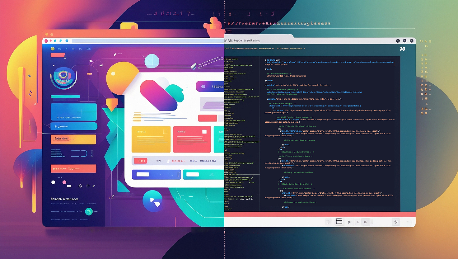
⚙️ Base HTML Email Boilerplate (Copy & Paste)
Copy and paste this into your favorite email editor or ESP (email service provider):
<!--
  📧 Email Boilerplate
  ▸ Source: EmailTechnica.com
  ▸ Version: 06.12.2025
-->

<!DOCTYPE html>
<html lang="en" xmlns="http://www.w3.org/1999/xhtml">

<head>
  <meta charset="UTF-8">
  <meta name="viewport" content="width=device-width, initial-scale=1.0">
  <meta name="x-apple-disable-message-reformatting">
  <meta http-equiv="X-UA-Compatible" content="IE=edge">

  <!-- Email subject line shown in browser tab -->
  <title>Email Title</title>

  <!--[if gte mso 9]>
  <xml>
    <o:OfficeDocumentSettings>
      <o:AllowPNG/>
      <o:PixelsPerInch>96</o:PixelsPerInch>
    </o:OfficeDocumentSettings>
  </xml>
  <![endif]-->

  <style>
    html, body {
      margin: 0;
      padding: 0;
      height: 100%;
      background-color: #f4f4f4;
    }

    img {
      border: 0;
      line-height: 100%;
      vertical-align: middle;
      max-width: 100%;
      height: auto;
      display: block;
    }

    table {
      border-spacing: 0;
      border-collapse: collapse;
      table-layout: fixed;
    }

    @media screen and (max-width: 600px) {
      .stack-column {
        display: block !important;
        width: 100% !important;
        max-width: 100% !important;
      }
    }
  </style>
</head>

<body lang="en" style="margin: 0; padding: 0; background-color: #f4f4f4; line-height: 1.5; font-family: Arial, Helvetica, sans-serif;">

  <!-- Full Width Wrapper -->
  <table role="presentation" width="100%" bgcolor="#f4f4f4" cellpadding="0" cellspacing="0" border="0">
    <tr>
      <td align="center" style="padding: 20px;">

        <!-- Email Container -->
        <table role="presentation" class="email-container" width="100%" cellpadding="0" cellspacing="0" border="0" style="max-width: 600px; margin: 0 auto; background-color: #ffffff;">

          <!-- Header -->
          <tr>
            <td style="padding: 20px; text-align: center; background-color: #222222; color: #ffffff;">
              <h1 style="margin: 0; font-size: 24px; font-family: Arial, Helvetica, sans-serif;">Your Company</h1>
            </td>
          </tr>

          <!-- Body Content -->
          <tr>
            <td style="padding: 20px; font-size: 16px; color: #333333;">
              <p style="margin: 0 0 15px;">Hello there,</p>
              <p style="margin: 0 0 15px;">This is a sample HTML email layout. You can customize this template with your own content, styles, and components.</p>
              <p style="margin: 0 0 15px;">Keep things simple and clean for better compatibility across all inboxes.</p>
            </td>
          </tr>

          <!-- Call to Action -->
          <tr>
            <td align="center" style="padding: 20px;">
              <a href="#" style="background-color: #007BFF; color: #ffffff; text-decoration: none; padding: 12px 20px; font-family: Arial, Helvetica, sans-serif; font-size: 16px; display: inline-block; border-radius: 4px;">
                Call to Action
              </a>
            </td>
          </tr>

          <!-- Footer -->
          <tr>
            <td style="padding: 20px; text-align: center; font-size: 12px; color: #888888;">
              <p style="margin: 0;">© 2025 Your Company. All rights reserved.</p>
              <p style="margin: 0;"><a href="#" style="color: #888888; text-decoration: underline;">Unsubscribe</a></p>
            </td>
          </tr>

        </table>
        <!-- End Email Container -->

      </td>
    </tr>
  </table>

</body>
</html>
Why This Boilerplate Works
This email boilerplate is lightweight, responsive, and accessible — and it’s compatible with virtually every major email client. Here’s what makes it solid:
1. Doctype
<!DOCTYPE html>The doctype should be the very first line of any HTML document. This declares the document as HTML5, which is the latest version of HTML and is widely supported by modern browsers.
2. HTML Element
<html lang="en" xmlns="http://www.w3.org/1999/xhtml">
lang="en": Sets the email’s default language for better accessibility and screen reader support.dir="ltr": Defines the text direction as left-to-right.
3. Meta Tags
  <meta charset="UTF-8">
  <meta name="viewport" content="width=device-width, initial-scale=1.0">
  <meta name="x-apple-disable-message-reformatting">
<meta charset="utf-8">: Ensures proper character encoding, supporting a wide range of languages and symbols.<meta name="viewport" content="width=device-width, initial-scale=1">: Makes the email responsive by setting the width.<meta name="x-apple-disable-message-reformatting">: Stops Apple Mail from auto-scaling emails, ensuring your email works as intended.
4. Title Tags
    <!-- Email subject line shown in browser tab -->
    <title>Email Title</title>
While not visible in most email clients, the title tag is important for emails opened in browsers. It also helps with accessibility and can appear in some email client previews.
5. XML for Outlook
    <!--[if gte mso 9]><xml>
        <o:OfficeDocumentSettings>
            <o:AllowPNG/>
            <o:PixelsPerInch>96</o:PixelsPerInch>
        </o:OfficeDocumentSettings>
    </xml><![endif]-->
This conditional comment ensures that Windows versions of Outlook render the email correctly, especially on high-DPI screens. The PixelsPerInch setting improves rendering quality.
6. Responsive + Accessible CSS
- Mobile-first responsiveness with media queries
- Image auto-scaling
- Table-based layout for max compatibility
- Font fallbacks and
line-heightfor readability - Clear role and language semantics
Final Thoughts
A rock-solid boilerplate like this one is your best friend in email development. It acts as your reliable starting point — saving you time, reducing errors, and eliminating the guesswork of coding emails from scratch. Instead of reinventing the wheel for every campaign, you get a pre-tested foundation that works seamlessly across devices, email clients, and screen readers. It helps ensure your emails render consistently, load quickly, and meet accessibility standards. Whether you’re launching a fast-turnaround marketing blast or a carefully crafted product announcement, a dependable boilerplate lets you focus on the message and design — not the quirks of email code.
Pro Tip
Keep this as a basic starting point. Then, for every email you build, make an exact copy of it, and then simply adjust it to fit what you need.